Justification of your flow map design
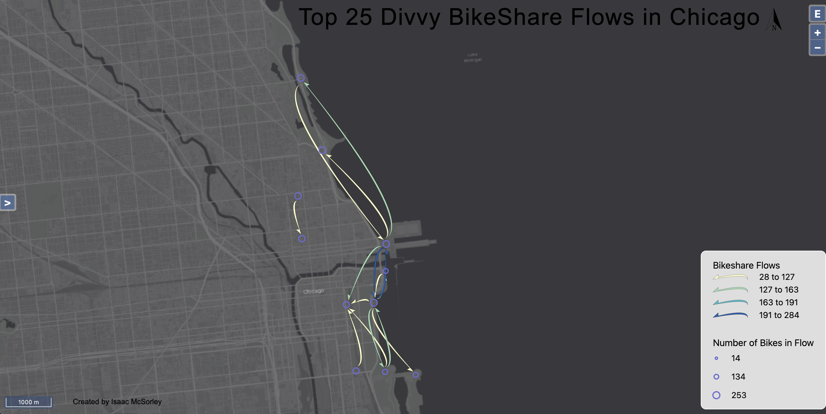
1. Flow map symbology: The flow map symbology chosen for this assignment
is justified based on the following aspects: a. Point symbols (nodes):
Green color was chosen for the nodes as it contrasts well with the dark
grey canvas background, making them easily visible. Proportional scaling
for the nodes allows for a clear visual representation of the relative
importance of each location in terms of bike-sharing activity. b. Flow
symbols: The curved half arrow style was chosen for the flows as it
provides a visually appealing representation of the movement direction and
avoids overlap with the nodes. Natural breaks classification helps in
simplifying the representation of data and makes it easier to identify
patterns in flows and the colors stand out easier. It does make it a
little more confusing because it is not simple easy numbers on the legend,
but it allows the data to be distributed and to visually see which areas
have more/less flows. c. Background choropleth map: The dark grey canvas
background was selected as it provides a neutral and unobtrusive backdrop
that allows the flow lines and nodes to stand out, enhancing the
readability of the flow map.
2. Flow map elements: The flow map includes a title of "Top 50 Chicago
bikeshare flows." I have also included a proper legend to explain the
color scheme, node scaling, and flow classifications. Additional elements
included the north arrow and the size comparison 1000m
3. Fill and outline colors: The yellow-green-blue color scheme chosen for
the flows allows for an easy and intuitive understanding of the number of
flows corresponding to each break in the data. The green color for the
nodes contrasts well with the dark background and complements the color
scheme of the flows.
4. Visual clutter reduction: Limiting the visual clutter produced by
overlapping flow lines is achieved by carefully adjusting the "show top
flows" option on Flow Symbology, focusing only on the most significant
flows to highlight the most important patterns and trends. I chose to only
show the top 25 flows. I believe this is enough to get the understanding
of the top flows in the area while not cluttering the map and making it
harder to concentrate on individual flows.
Interpretation of Flow Patterns:
1. Places that attract/receive the most flows: The downtown Loop area of
Chicago and the Navy Pier have the highest number of flows (238),
indicating that these areas are significant hubs for bikeshare activity.
2. Places that send the most flows: The south side of Chicago sends most
of the flows north to the Loop area, while the north end of Chicago sends
flows south.
3. General direction of flows: One key thing to notice is there are no top
flows going east or west. The flows are primarily in a north-south
direction, reflecting the geography of the city and the distribution of
bikeshare stations.
4. Flow patterns in relation to location characteristics: The flow
patterns indicate that the majority of bikeshare activity is concentrated
in and around the downtown Loop area, where businesses and traffic are
denser. Additionally, flows on the east side of Chicago often cross the
river at a similar location, suggesting the presence of key bikeshare
routes or bridges that facilitate movement between the two sides of the
city. Another factor is number of bikes in each location. After living in
downtown Chicago last summer, I found that there are many more Divvy bikes
located in the downtown area (The Loop, River North). The flow map
effectively demonstrates how these location characteristics influence the
flow patterns observed in the data.